Classic Endpapers
Recently I was introduced to an art treasure trove: a friend’s brother’s work, created in the 60s and 70s, now kept in a huge reddish brown cardboard portfolio.
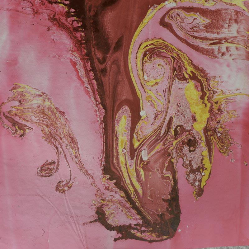
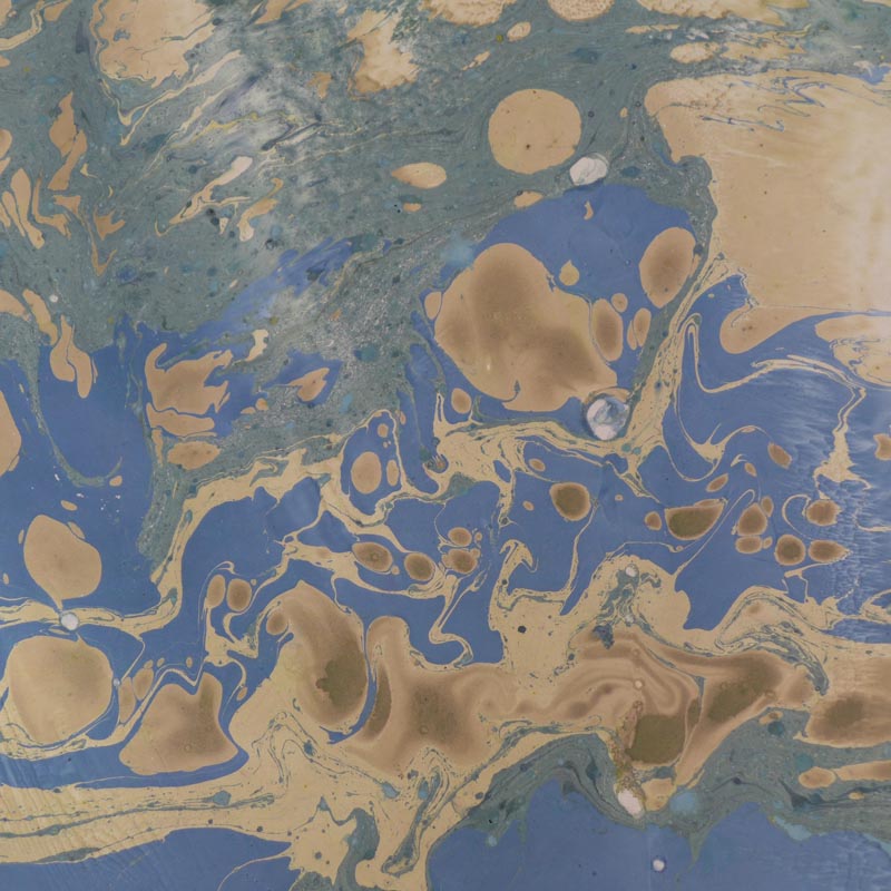
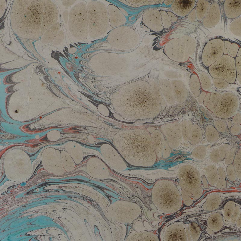
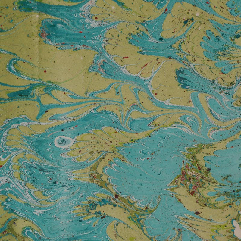
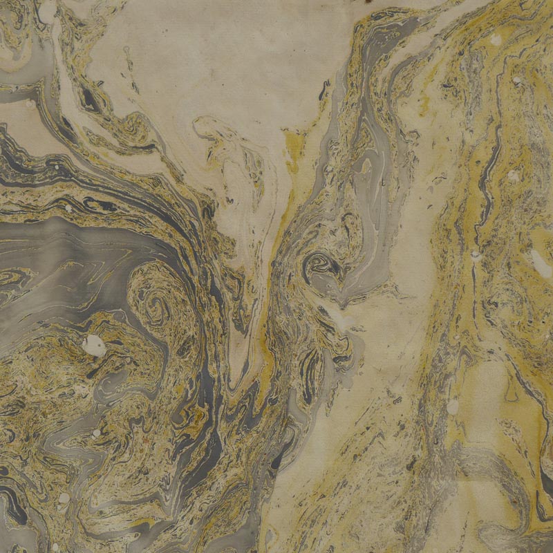
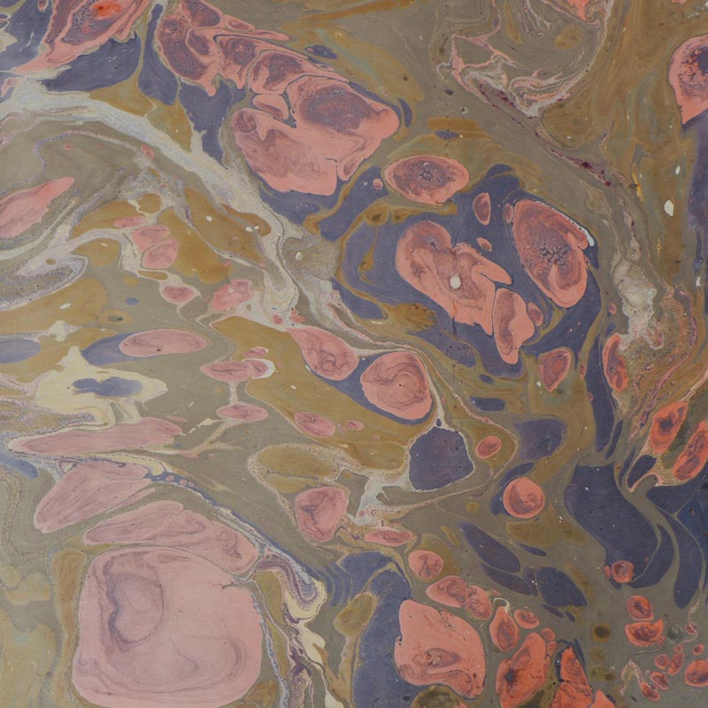
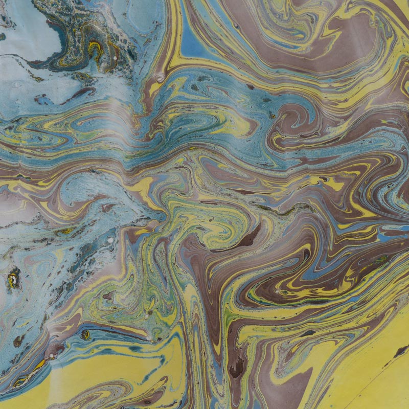
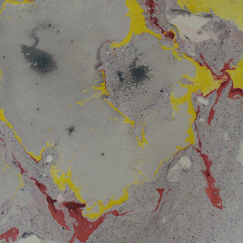
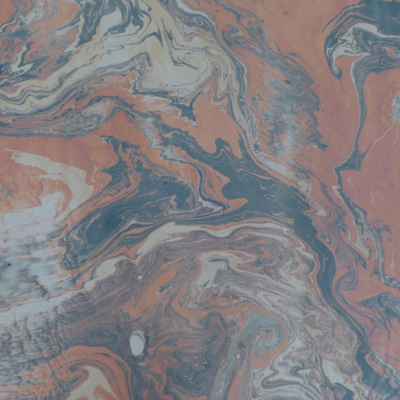
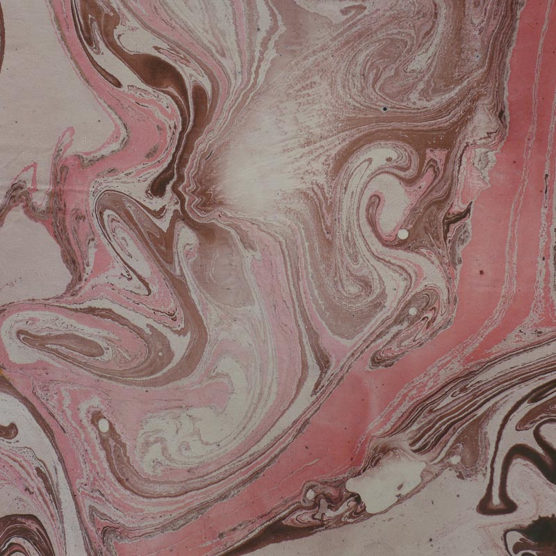
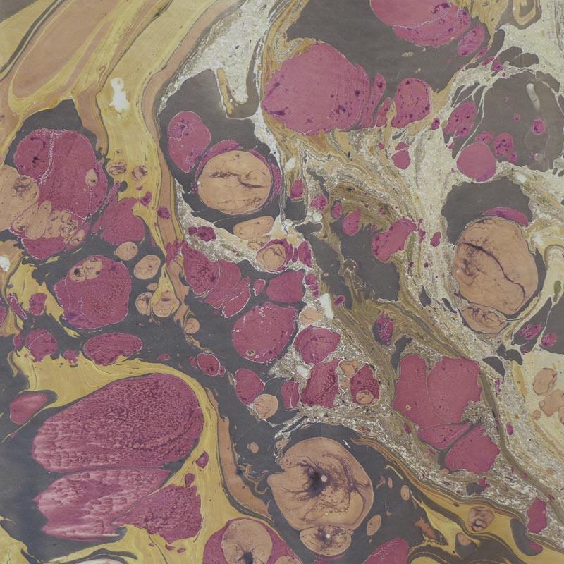
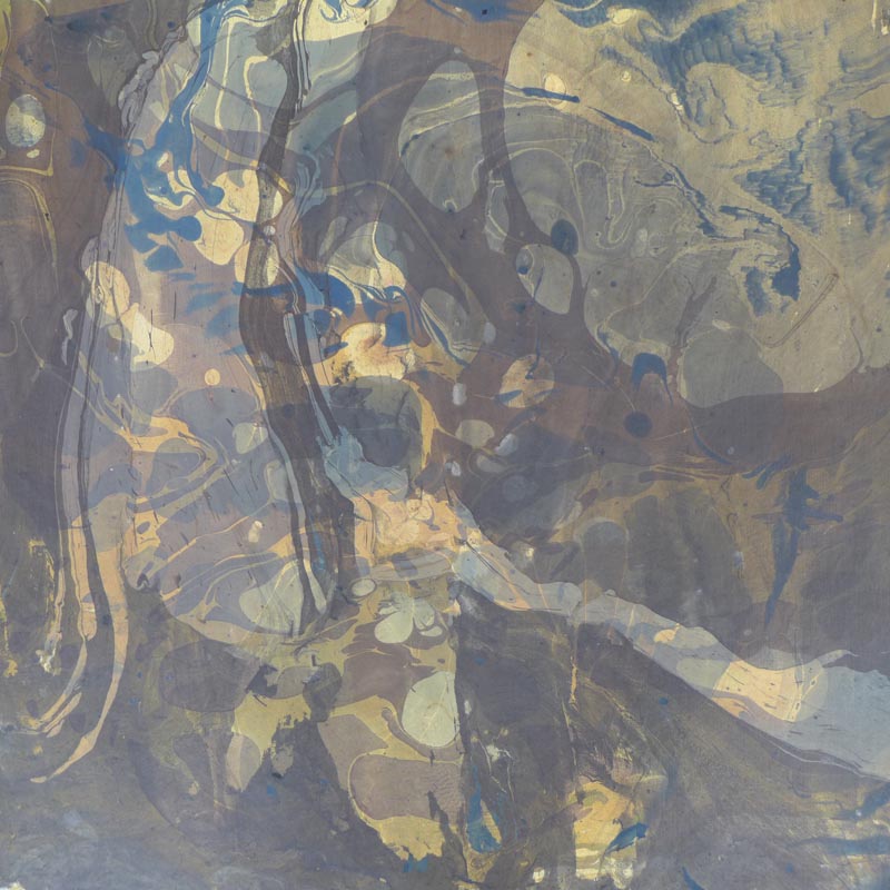
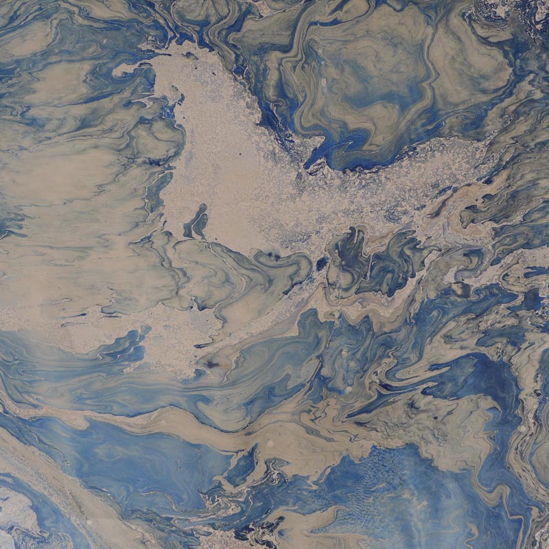
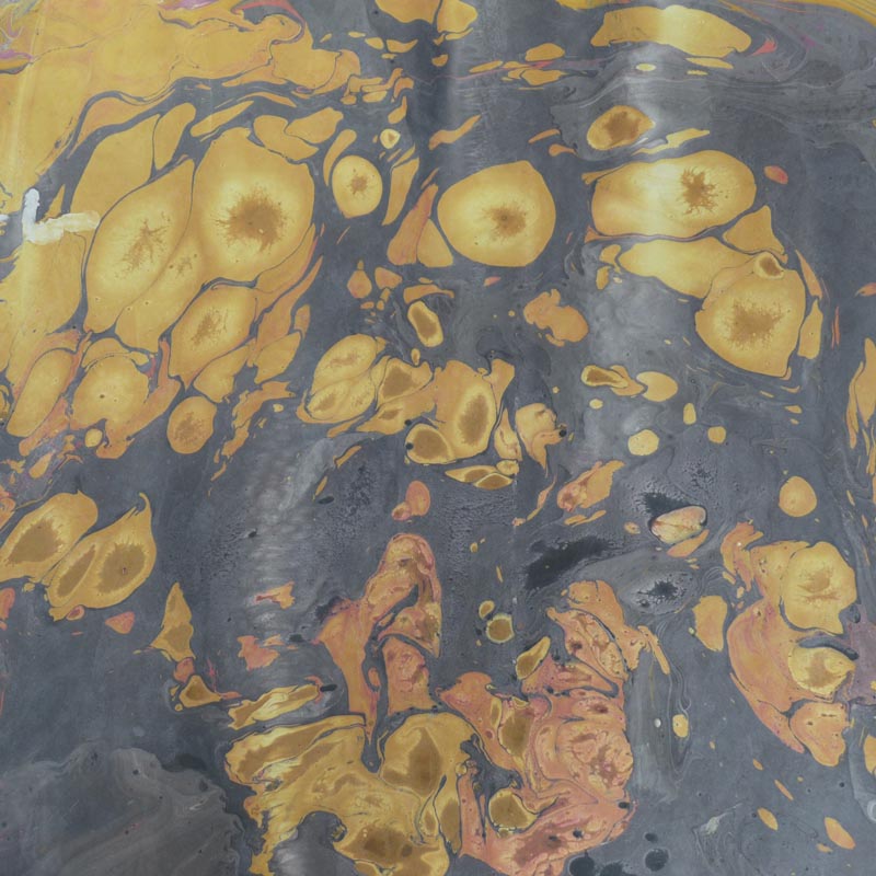
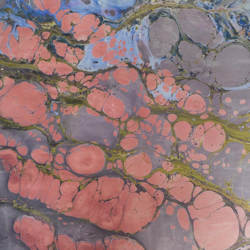
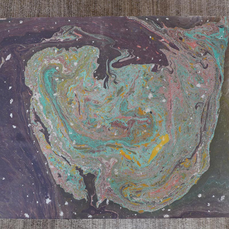
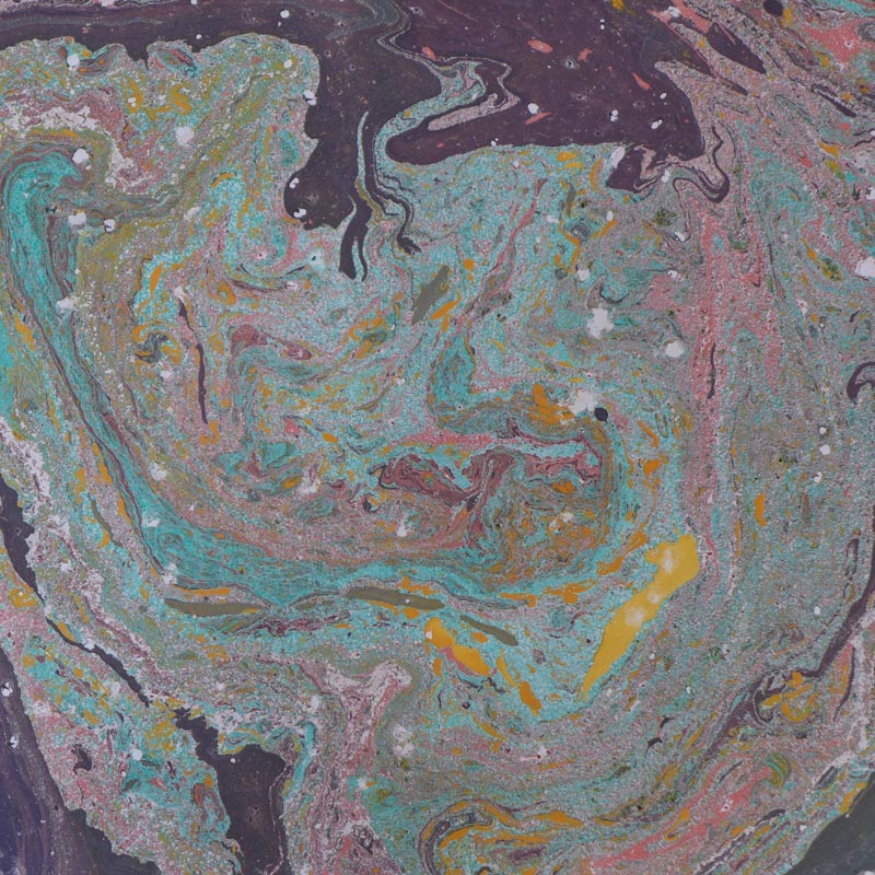
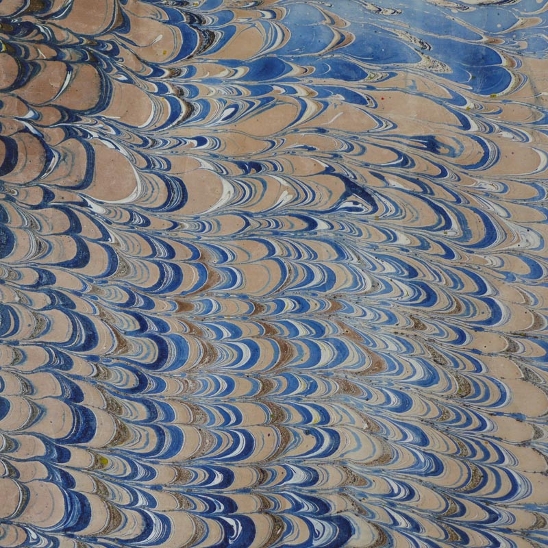
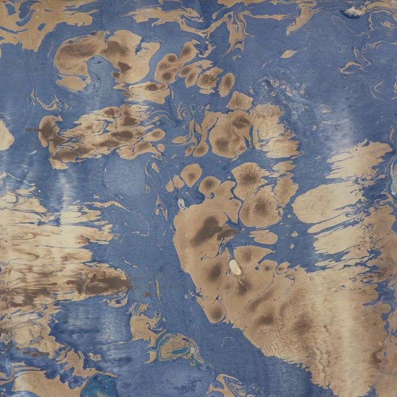
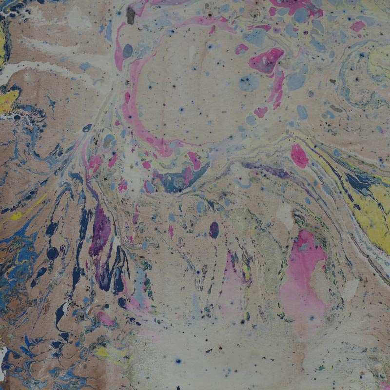
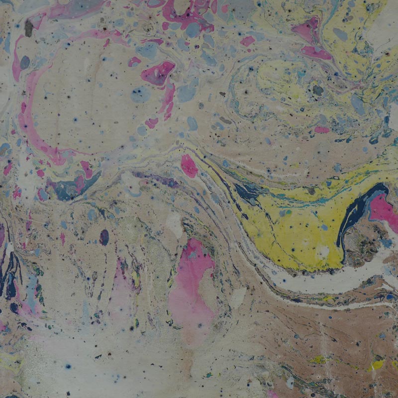
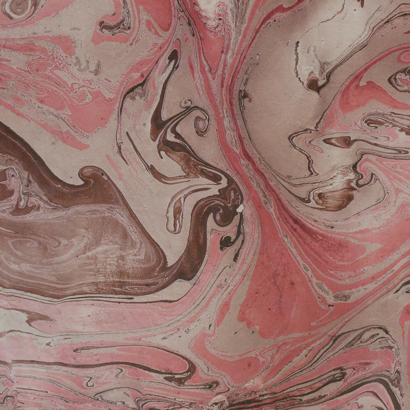
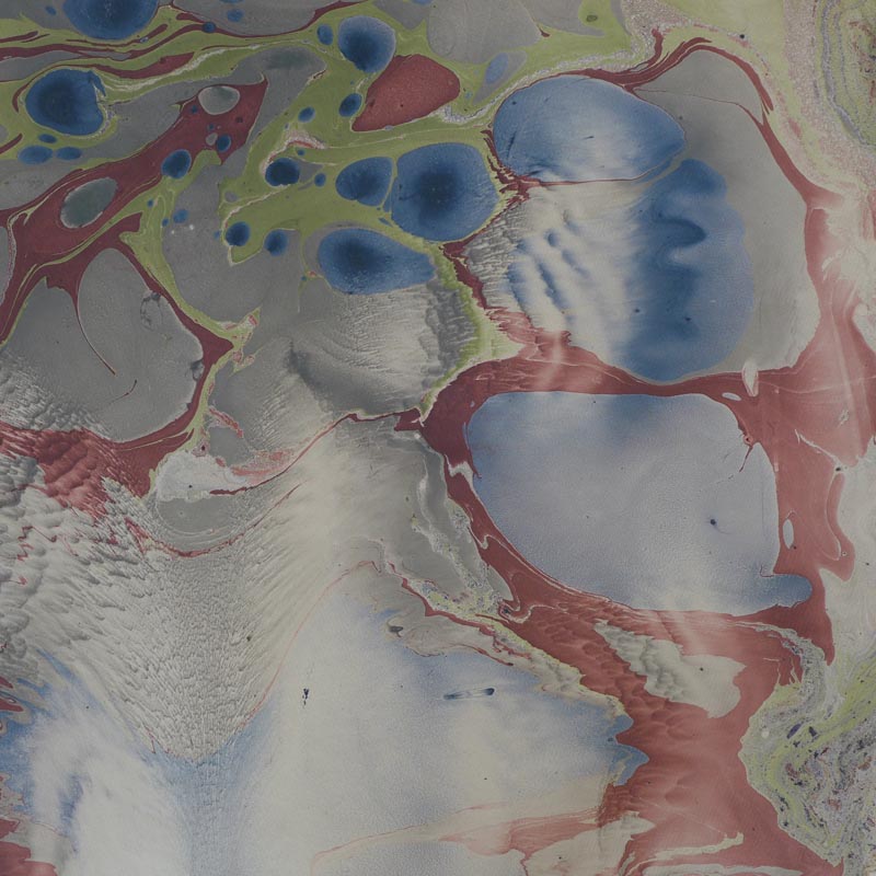
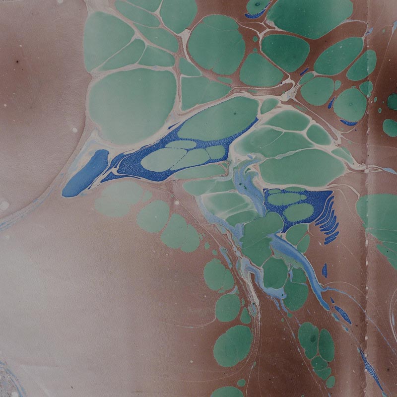
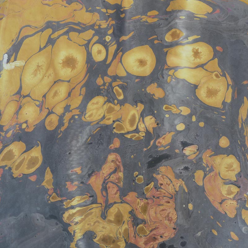
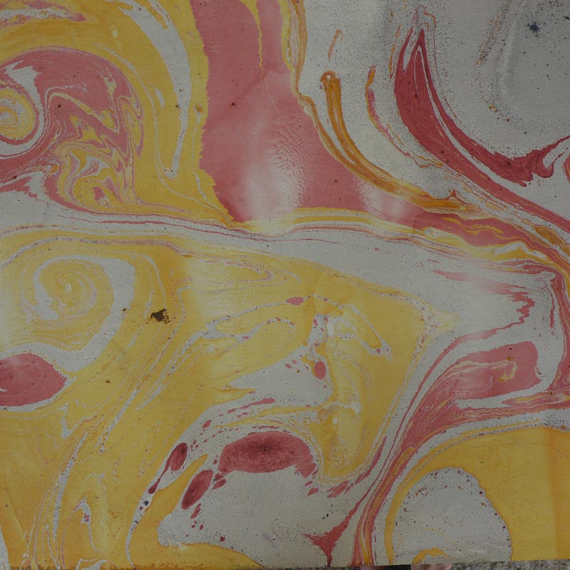
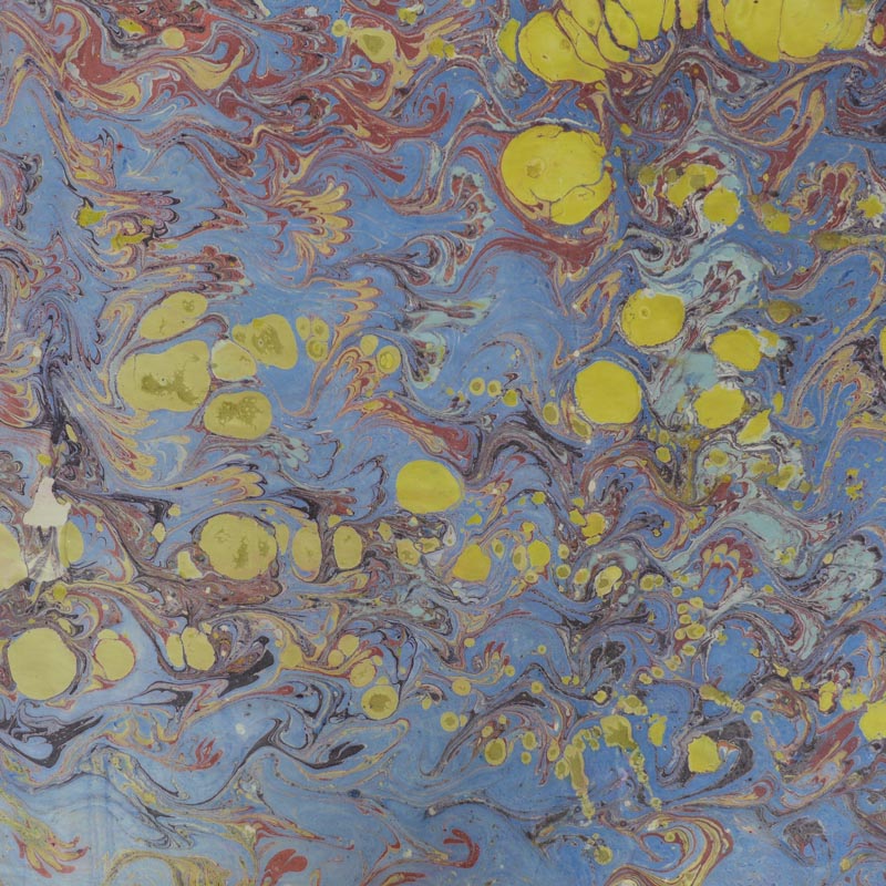
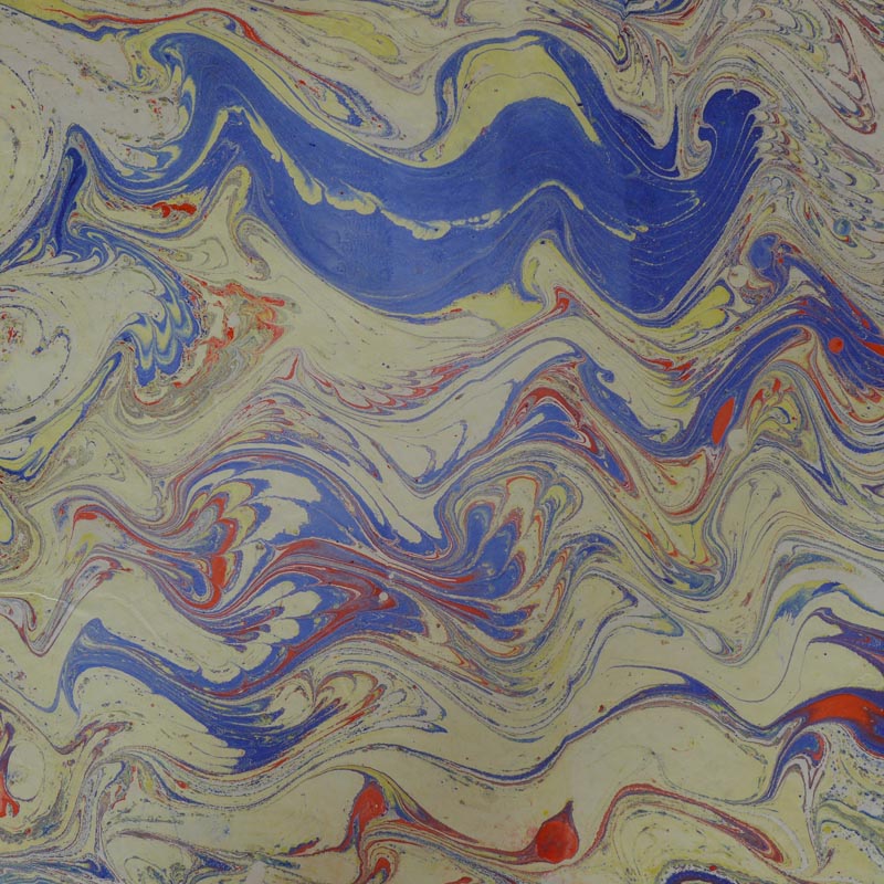
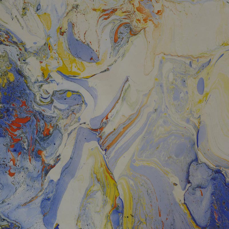
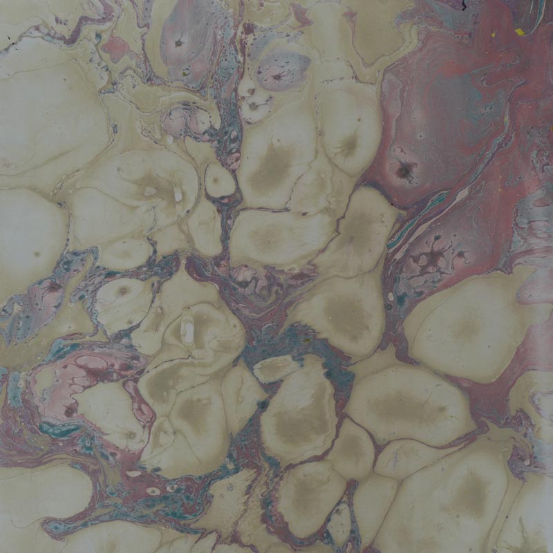
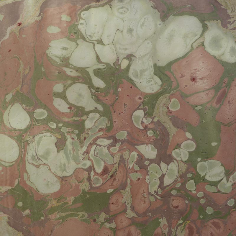
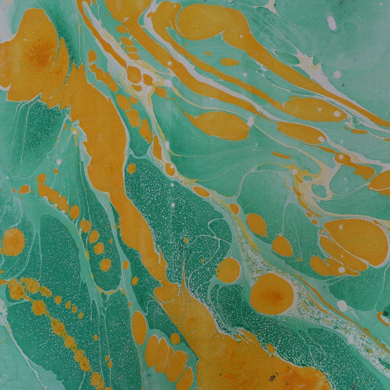
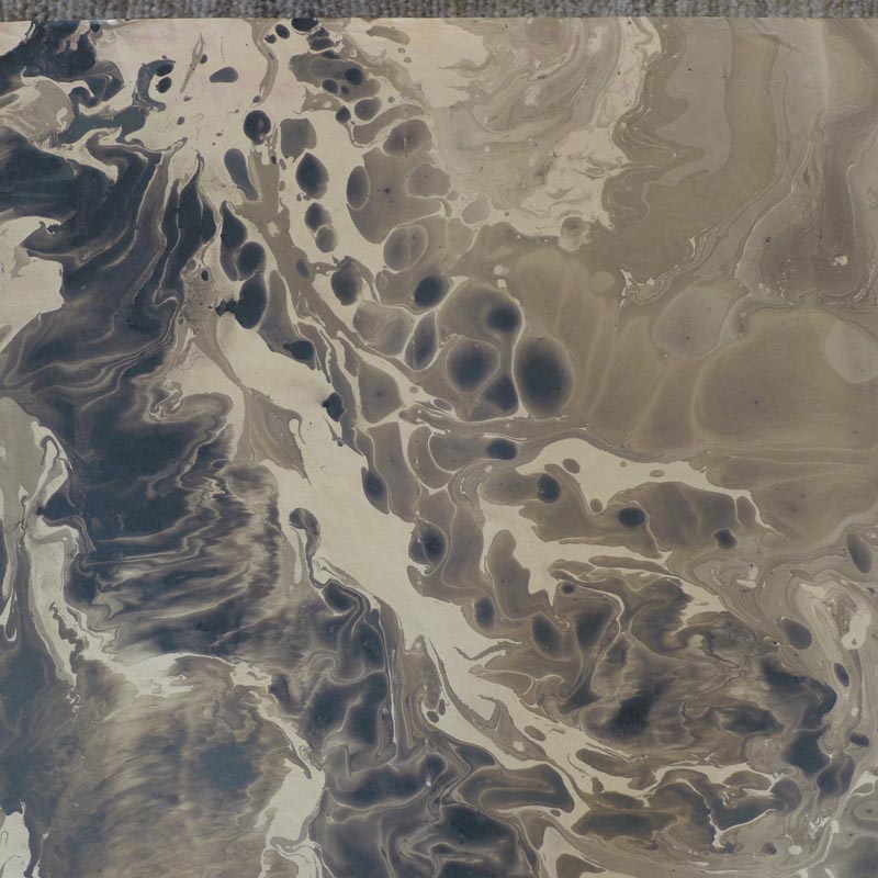
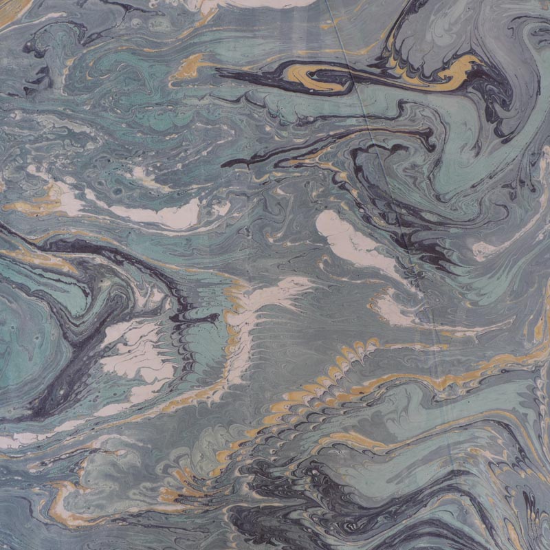
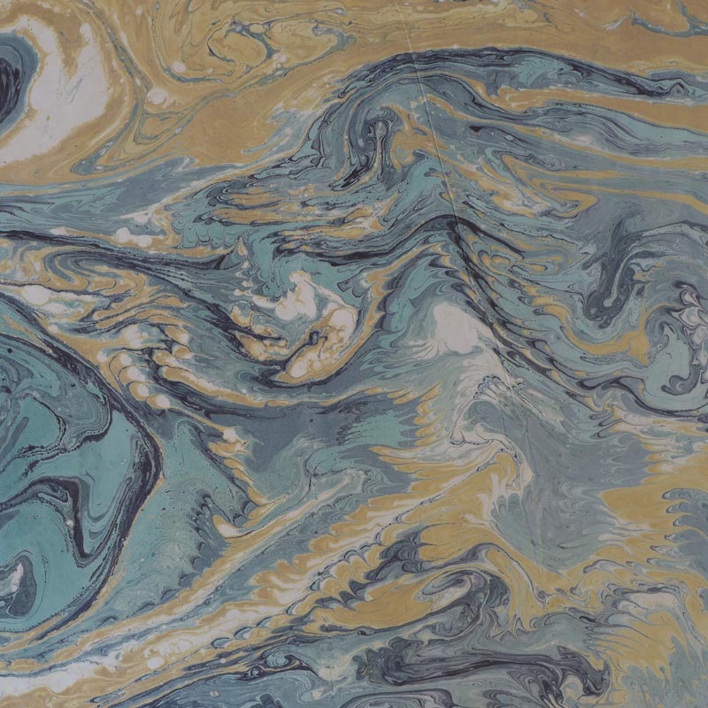
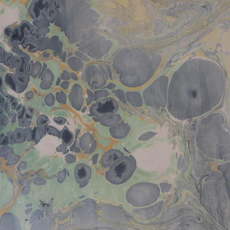
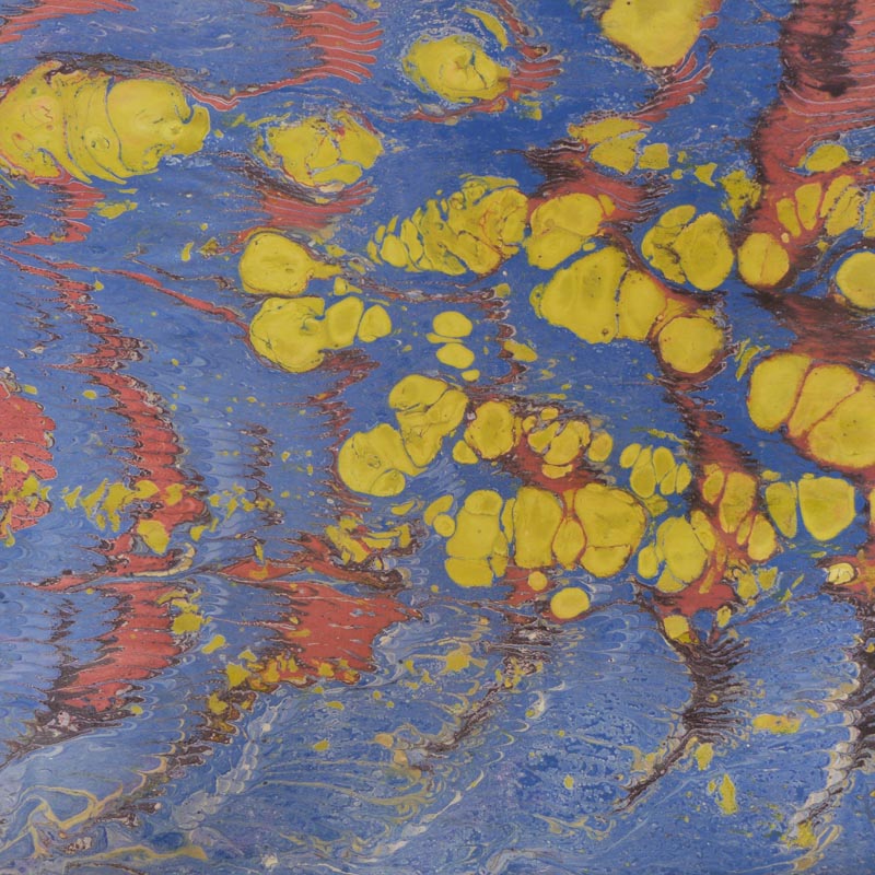
The medium was good quality roughly 22 x30 inch art paper, which had been manipulated while floating face down in oil infused water.
This simple water surface process has been around for ages. First seen in China during the 10th Century, it was called “flowing sand” technique. The 12th Century Japanese called it “floating ink,” and 15th Century Islamic artisans called it “clouded paper.”
The technique spread to Europe by the 17th Century and became the standard
decoration for bookbinder’s endpapers that we are all familiar with.
The treasure I was given to work with included the tight feather patterns common to endpaper art, but abstract works as well. And whether the outcomes were accident or artistry, I cannot say. Happy accidents at the least.
I have been only vaguely interested in color theory from a scientific standpoint, rather than an emotional one. So, having been offered to select two works to keep as a gift from a stack of two hundred, and finding it hard to reject any, I approached it this way:
Which ones appealed, simply appealed? No time for “why.” Why does not matter so much in appreciation of color and form etc.
What is it (or what it seems to represent) does matter, but in a personal sense, and that is when to say “why” for me. For example: the dragon image, why do I like him? His archetypal impact? Or just a fun image to encounter?
But enough blather.
Color first and form second. Then I saw that I responded to the loosely abstract rather than the tight patterns that were in the form of the Italian bookbinder’s endpapers.
As an interior designer with a strong focus on color, I saw this as an exercise and a tool to see how others might respond, first to the colors themselves, not just raw single colors, but the magical, unusual combination of colors that attracted me.
The artistry that was expressed in the combinations, and finally in the forms they took together, inspired me to photograph the entire collection. Because I discovered our ubiquitous tool, the ipad, was just not going to capture the color, I enlisted a friendly amateur-pro, and here is what we have: my favorites, culled from two hundred. Enjoy!
Palette Studies Based on 10th Century Art Form